Visualizing deviation in mean daily temperature in Lucknow, India from the historical average
In this blog, we will try to visualize the deviation in mean daily temperature in Lucknow, India in last ten years compared to the historical average.
Lets load the essential libraries first.
library(dplyr)
library(ggplot2)
library(lubridate)
library(zoo)
Lets read in the temperature data for Lucknow, India.We obtained the data from Global Historical Climatology Network daily.
weather_data <- read.csv("temp_data_lko.csv", stringsAsFactors = FALSE)

head(weather_data)
## STATION NAME DATE TAVG TMAX TMIN
## 1 IN023351400 LUCKNOW AMAUSI, IN 1981-01-01 58 73 45
## 2 IN023351400 LUCKNOW AMAUSI, IN 1981-01-02 58 73 46
## 3 IN023351400 LUCKNOW AMAUSI, IN 1981-01-03 59 75 45
## 4 IN023351400 LUCKNOW AMAUSI, IN 1981-01-04 61 77 52
## 5 IN023351400 LUCKNOW AMAUSI, IN 1981-01-05 60 73 54
## 6 IN023351400 LUCKNOW AMAUSI, IN 1981-01-06 60 70 48In this dataset, we are only interested in “Date” and “TAVG” columns. Therefore, we will only select these columns. We will also convert the date column from “character” to “dates”.
weather_data <- weather_data %>%
  select("DATE", "TAVG")

weather_data$DATE <- as.Date(weather_data$DATE)

head(weather_data)
## DATE TAVG
## 1 1981-01-01 58
## 2 1981-01-02 58
## 3 1981-01-03 59
## 4 1981-01-04 61
## 5 1981-01-05 60
## 6 1981-01-06 60Historical Averages
In this chart we are interested in showing how is the temperate in different months since 2010 changed from the historical averages each month. Therefore, we will first take the average of historical data. For, this analysis we are going to take the daily average of temperature each day from 1981-2010.
Here, the idea is the between 1981 and 2010, we will calculate the average for each day over this time period.
avg_temp <- weather_data %>%
  filter(DATE>"1981-01-01" & DATE< "2010-01-01") %>%
  filter(!(is.na(TAVG))) %>%
  mutate(doy=yday(DATE)) %>%
  group_by(doy) %>% #here we group by each day of all the years in the time period
  summarise(doytavg=mean(TAVG)) #now we calculate the average

head(avg_temp)
## # A tibble: 6 x 2
## doy doytavg
## <dbl> <dbl>
## 1 1 55.6
## 2 2 56.6
## 3 3 55.9
## 4 4 56.1
## 5 5 56.1
## 6 6 56.9Checking how the line chart of the average temperature.
ggplot(avg_temp, aes(x = doy, y = doytavg))+
geom_line()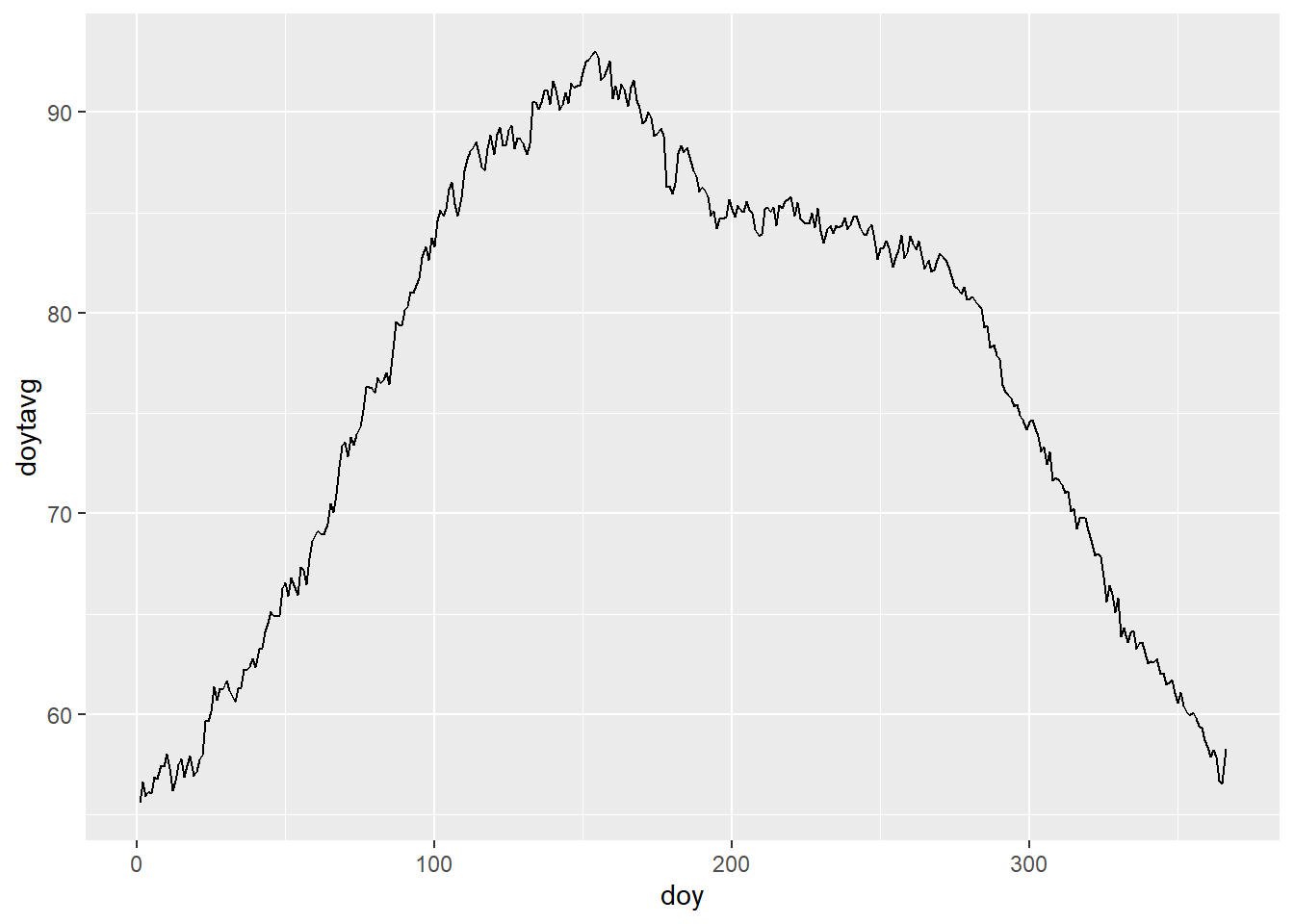 This chart looks fine but, we need a a smoother average line on which we can then plot the temperature changes from 2010 to 2021. To accomplish this, we wil use the rollmean() function from the “zoo” package.
avg_temp$rollavg20 <- rollmean(avg_temp$doytavg, 20, fill = c(NA, NA, NA), align = "center")

(avg_temp)
## # A tibble: 366 x 3
## doy doytavg rollavg20
## <dbl> <dbl> <dbl>
## 1 1 55.6 NA
## 2 2 56.6 NA
## 3 3 55.9 NA
## 4 4 56.1 NA
## 5 5 56.1 NA
## 6 6 56.9 NA
## 7 7 56.8 NA
## 8 8 57.4 NA
## 9 9 57.4 NA
## 10 10 58.0 56.9
## # ... with 356 more rowsWith rollmean, we provide a window of 10 data point, and the use align as “center”. The “center” parameter in align calculates the mean for a data point by taking the ten data points before and ten data points after the point for which it is calculating the mean. And with “fill” command we instruct the code to fill with “NA” for the points it is unable to find a window. These are the first and last ten rows in “avg_temp”.
The issue here is that rollmean() does not know to connect the first day of the year to the last day to calculate the rolling mean. Therefore, we create a new column where we subtract that last 20 days of december from 366. The we arrange the whole data frame in ascending order by this column. ow we calculate the rolling average again in the new column and replace the NAs in from the old rolling average column with the new averages.
avg_temp <- avg_temp %>%
  mutate(doy2=ifelse(doy>345, doy-366, doy))  %>%
  arrange(doy2) %>%
  mutate(rollavg_2=rollmean(doytavg, 20, fill = c(NA, NA, NA)))  %>%
  mutate(rollavg20=ifelse(is.na(rollavg20), rollavg_2, rollavg20)) %>%
select(-c("doy2", "rollavg_2"))

(avg_temp)
## # A tibble: 366 x 3
## doy doytavg rollavg20
## <dbl> <dbl> <dbl>
## 1 346 61.5 61.6
## 2 347 61.6 61.4
## 3 348 61.7 61.2
## 4 349 61.1 61.0
## 5 350 60.6 60.8
## 6 351 61.1 60.5
## 7 352 60.4 60.3
## 8 353 60.1 60.1
## 9 354 60.0 59.8
## 10 355 60.1 59.5
## # ... with 356 more rowsLets see how the rolling average smoothens the curve.
ggplot(avg_temp, aes(x = doy))+
geom_line(aes(y = doytavg))+
geom_line(aes(y = rollavg20), color="red")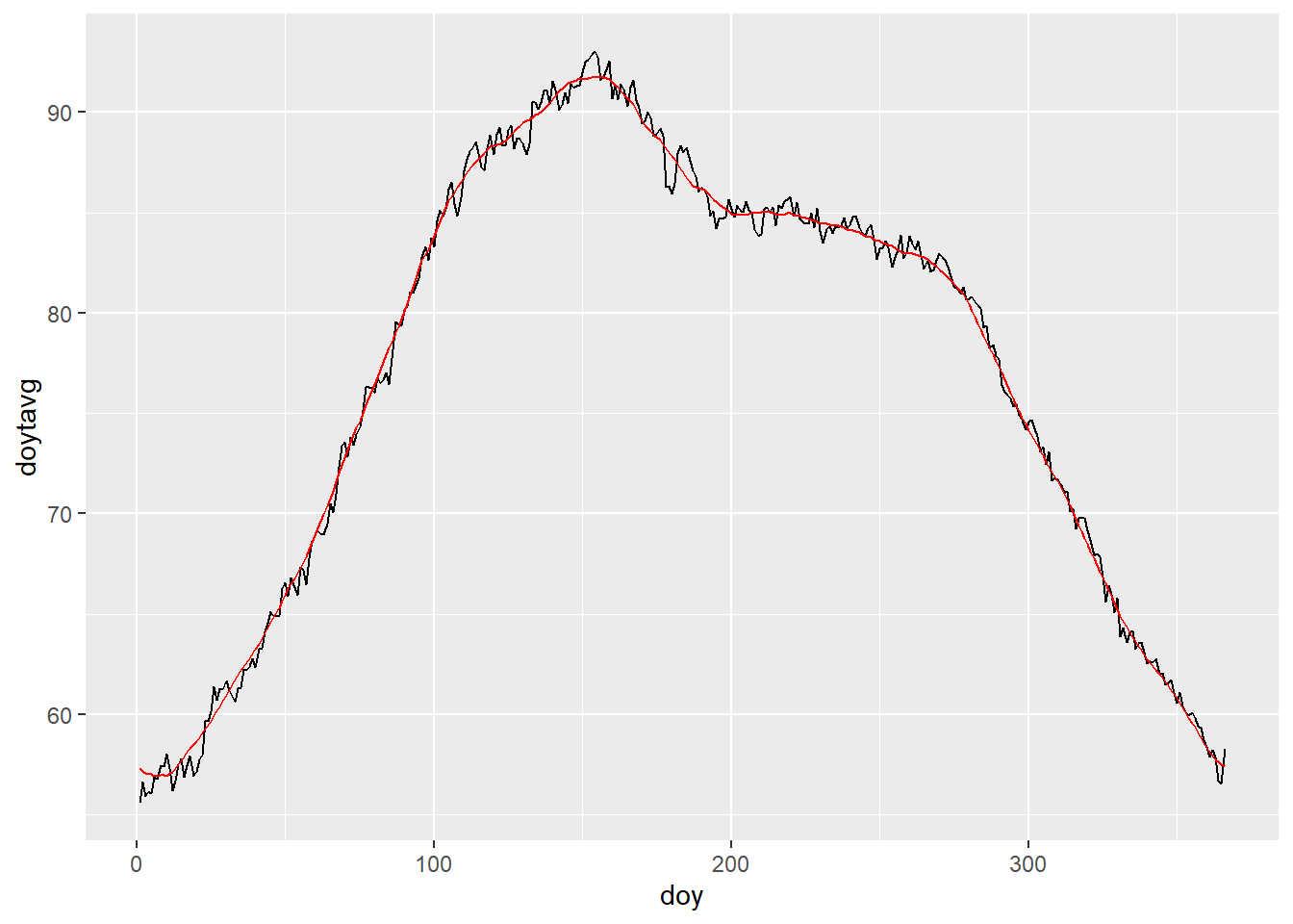 Now that we have calculate the historical average, we should now subset the dataset to the years for which we want to see the average difference in temperature from the average.
We will now create doy column to count the days for the date of the years (as we did before), and also get the year using the year() function. Then we join this subsetted data frame with our rolling average data frame. Finally we create the column which will provide us with the difference between out “TAVG” for our years of interest and the historical rolling temperature average. The code for all these steps can be found below:
avg_temp10now <- weather_data %>%
  filter(DATE>"2009-12-31") %>%
  mutate(doy=yday(DATE)) %>%
  mutate(year=year(DATE)) %>%
  left_join(avg_temp, by = "doy") %>%
  mutate(avgtTdiff=TAVG-rollavg20)


head(avg_temp10now)
## DATE TAVG doy year doytavg rollavg20 avgtTdiff
## 1 2010-01-01 53 1 2010 55.56000 57.30069 -4.300685
## 2 2010-01-02 53 2 2010 56.62069 57.14628 -4.146279
## 3 2010-01-03 53 3 2010 55.89286 57.04575 -4.045750
## 4 2010-01-04 55 4 2010 56.14286 57.00265 -2.002646
## 5 2010-01-05 54 5 2010 56.06897 56.99908 -2.999075
## 6 2010-01-06 55 6 2010 56.85185 56.92993 -1.929932NOw lets first plot the chart, and then i will explain what we did.
ggplot(avg_temp10now, aes(x = doy, y = rollavg20), color="#777777")+
geom_line()+
geom_rect(aes(xmin=doy-0.5, xmax=doy+0.5, ymin=rollavg20, ymax=TAVG, fill=avgtTdiff))+
facet_wrap(~year)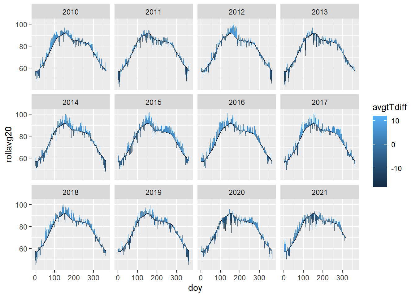 To create the above chart, first we create the line, and then we build small rectangles on top or below the line depending upon the difference between the “TAVG” and historical average. We finally fill these rectangles with the average difference column we calculate above. We centered the rectangle on the day of the year by adding and subtracting 0.5 from it. This also smooths the transition from one rectangle to other.
The fill is just one color but we want to show hotter and colder temperature from the rolling average by different gradient of colors. Here we basically want the diverging red and blue colors with 0 degree celsius as white. We will use scale_fill_gradient2() for this.
ggplot(avg_temp10now)+
geom_rect(aes(xmin=doy-0.5, xmax=doy+0.5, ymin=rollavg20, ymax=TAVG, fill=avgtTdiff))+
geom_line(aes(x = doy, y = rollavg20), color="#777777")+
scale_fill_gradient2(low="blue", high="red", name="Temperature anomaly", breaks=c(10,5,0,-5,-10))+
facet_wrap(~year, ncol=1)+
theme_minimal()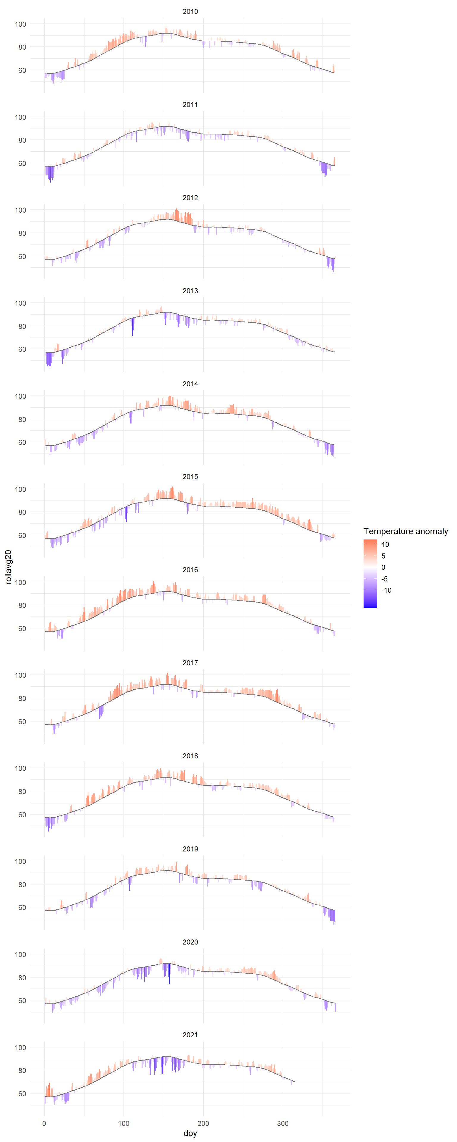 Now, we will add the month names instead of doy for the x-axis in the chart. We will add the month label on 16th day of each month. Here, we first get a sequence and extract the 16th date of each month. Then we convert the date to the days of the year using yday() function.
midmonths <- seq(ymd("2019-01-16"), ymd("2019-12-16"), by="month")
midmonths <- yday(midmonths)

midmonths
## [1] 16 47 75 106 136 167 197 228 259 289 320 350Now using scale_x_continuous() function we will add month labels to the chart.
ggplot(avg_temp10now)+
geom_rect(aes(xmin=doy-0.5, xmax=doy+0.5, ymin=rollavg20, ymax=TAVG, fill=avgtTdiff))+
geom_line(aes(x = doy, y = rollavg20), color="#777777")+
facet_wrap(~year, ncol=2) +
scale_fill_gradient2(low="blue", high="red", name="Temperature anomaly", breaks=c(10,5,0,-5,-10))+
scale_x_continuous(breaks = midmonths, labels=c("Jan", "Feb", "Mar", "Apr", "May", "Jun", "Jul", "Aug", "Sep", "Oct", "Nov", "Dec"))+
theme_minimal()+
xlab("")+ylab("")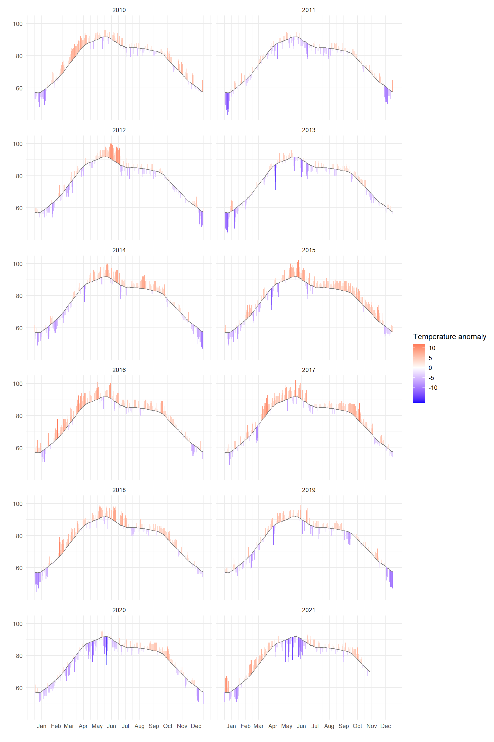 Now, we will add gray background rectangles at the names of every other month. This is not necessary but to we are adding these rectangles to make the charts more aesthetically pleasing.
The rectangle will start at the start date of every other month, and end at the last day of the month. We subtract 1 to get the last day.
band_start <- seq(ymd("2019-02-01"), ymd("2019-12-01"), by="2 months")
#converting dates to day of the year
band_start <- yday(band_start)

band_end <- seq(ymd("2019-03-01"), ymd("2020-01-01"), by="2 months")-1
#converting dates to day of the year
band_end <- yday(band_end)

#binding the start and end points for the rectangles
band <- cbind.data.frame(band_start, band_end)

head(band)
## band_start band_end
## 1 32 59
## 2 91 120
## 3 152 181
## 4 213 243
## 5 274 304
## 6 335 365Now, lets add the rectangles band in our chart.
ggplot(avg_temp10now)+
  theme_minimal()+
  geom_rect(data = band, aes(xmin=band_start, xmax=band_end), ymin=40, ymax=110, fill="#cccccc", alpha=0.5)+
  geom_rect(aes(xmin=doy-0.5, xmax=doy+0.5, ymin=rollavg20, ymax=TAVG, fill=avgtTdiff))+
    geom_line(aes(x = doy, y = rollavg20), color="#777777")+
  facet_wrap(~year, ncol=2) +
  scale_fill_gradient2(low="blue", high="red", name="Temperature anomaly", breaks=c(10,5,0,-5,-10))+
  scale_x_continuous(breaks = midmonths, labels=c("Jan", "Feb", "Mar", "Apr", "May", "Jun", "Jul", "Aug", "Sep", "Oct", "Nov", "Dec"))+
  xlab("")+ylab("")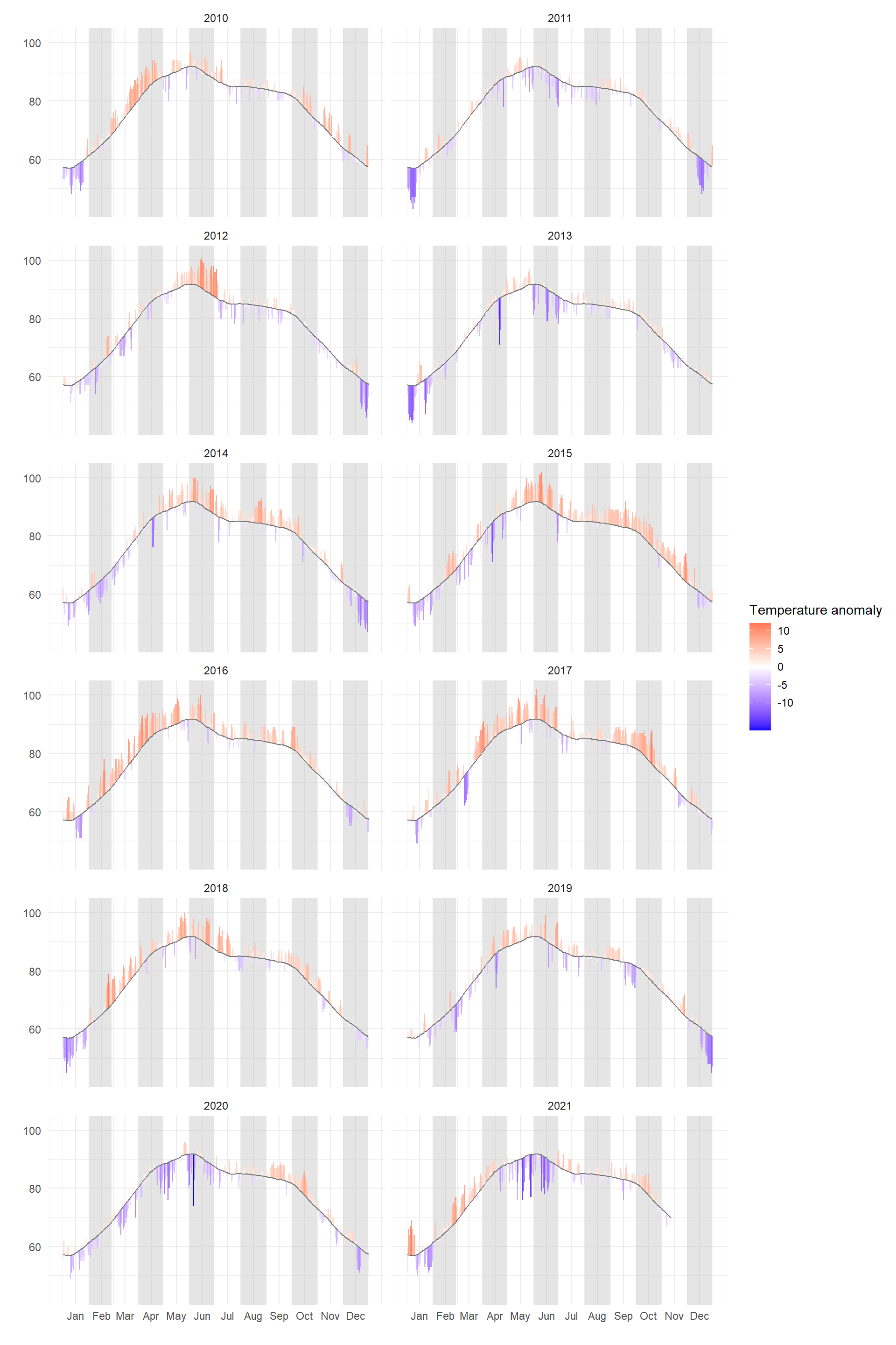
Now, we did a bit of styling like moving the legend to the bottom, and moving the y-axis to the right.
ggplot(avg_temp10now)+
  theme_minimal()+
  geom_rect(data = band, aes(xmin=band_start, xmax=band_end), ymin=40, ymax=110, fill="#cccccc", alpha=0.5)+
  geom_rect(aes(xmin=doy-0.5, xmax=doy+0.5, ymin=rollavg20, ymax=TAVG, fill=avgtTdiff))+
    geom_line(aes(x = doy, y = rollavg20), color="#777777")+
  facet_wrap(~year, ncol=2) +
  scale_fill_gradient2(low="blue", high="red", name="Temperature anomaly", breaks=c(10,5,0,-5,-10))+
  scale_x_continuous(breaks = midmonths, labels=c("Jan", "Feb", "Mar", "Apr", "May", "Jun", "Jul", "Aug", "Sep", "Oct", "Nov", "Dec"))+
  xlab("")+ylab("")+
  scale_y_continuous(position="right")+
  theme(
    axis.text = element_text(size = 17),
    legend.position = "bottom",
    legend.title = element_text(size = 18),
    legend.text = element_text(size = 12),
    panel.grid.minor.x = element_blank(),
    panel.grid.major.x = element_blank(),
    strip.text = element_text(hjust = 0, face = "bold", size = 20),
    plot.title = element_text(size = 25, face = "bold"),
    )+
  ggtitle("Lucknow, India daily mean temperature between \n 2010 and 2021 (compared to 1981-2010 average)")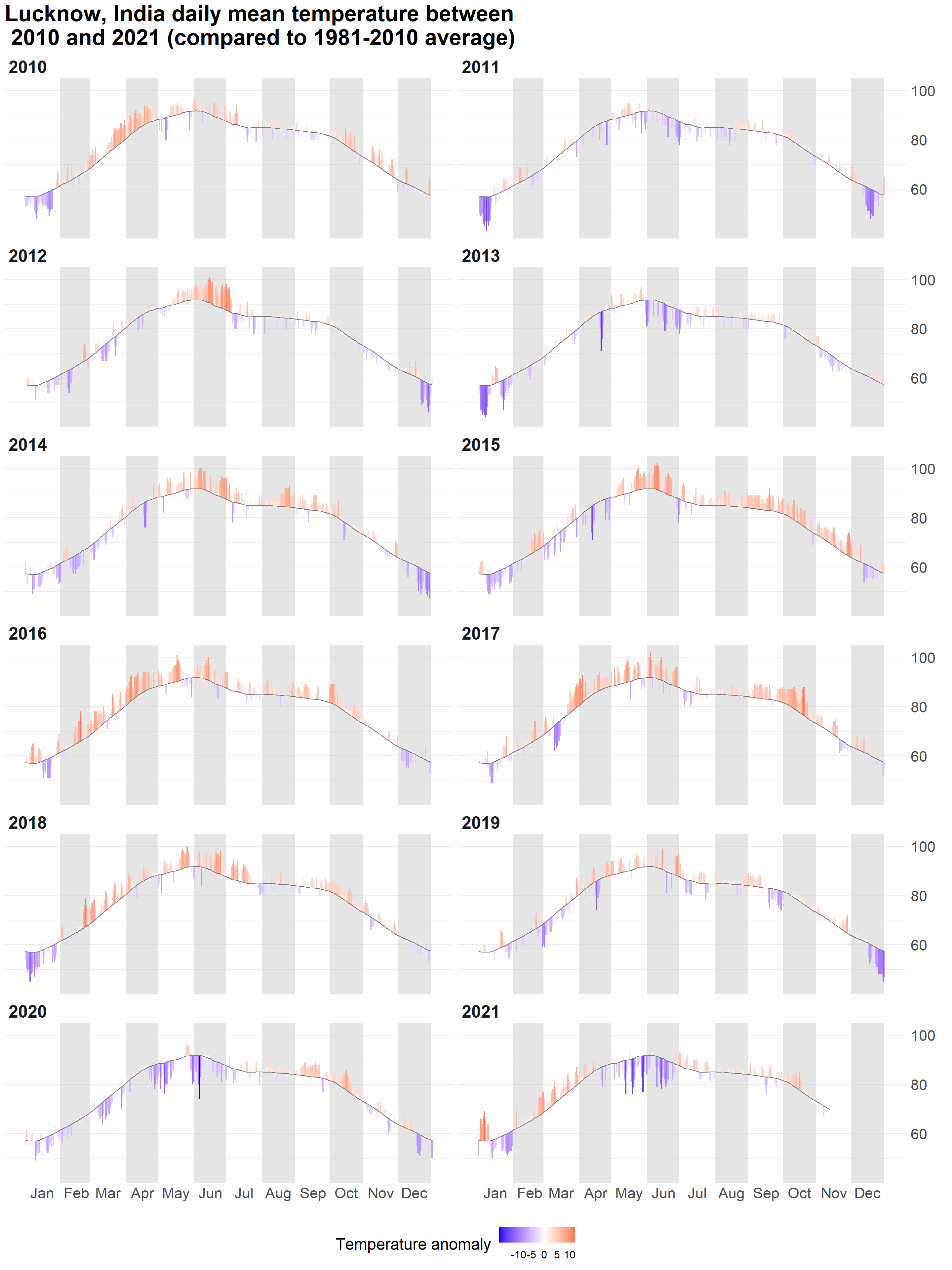
We can from the above chart that in last 10 years, many years were hotter than historical average in Lucknow. 2010, 2014, 2015, 2016, 2017, 2018, 2019, and 2021, had more months where the temperature was more than the historical average (see the red peaks in the chart). I will also like to thank Flowingdata for inspiration for this analysis.